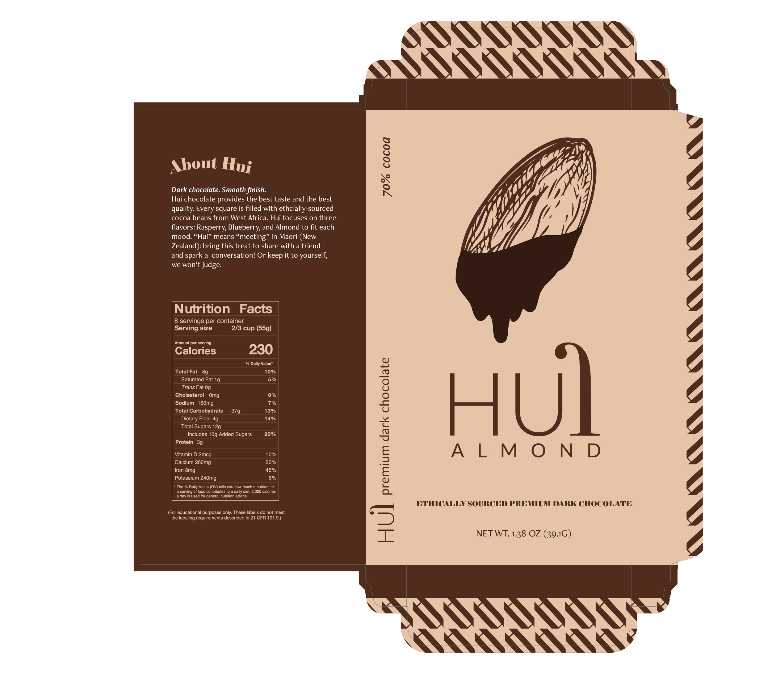
package design
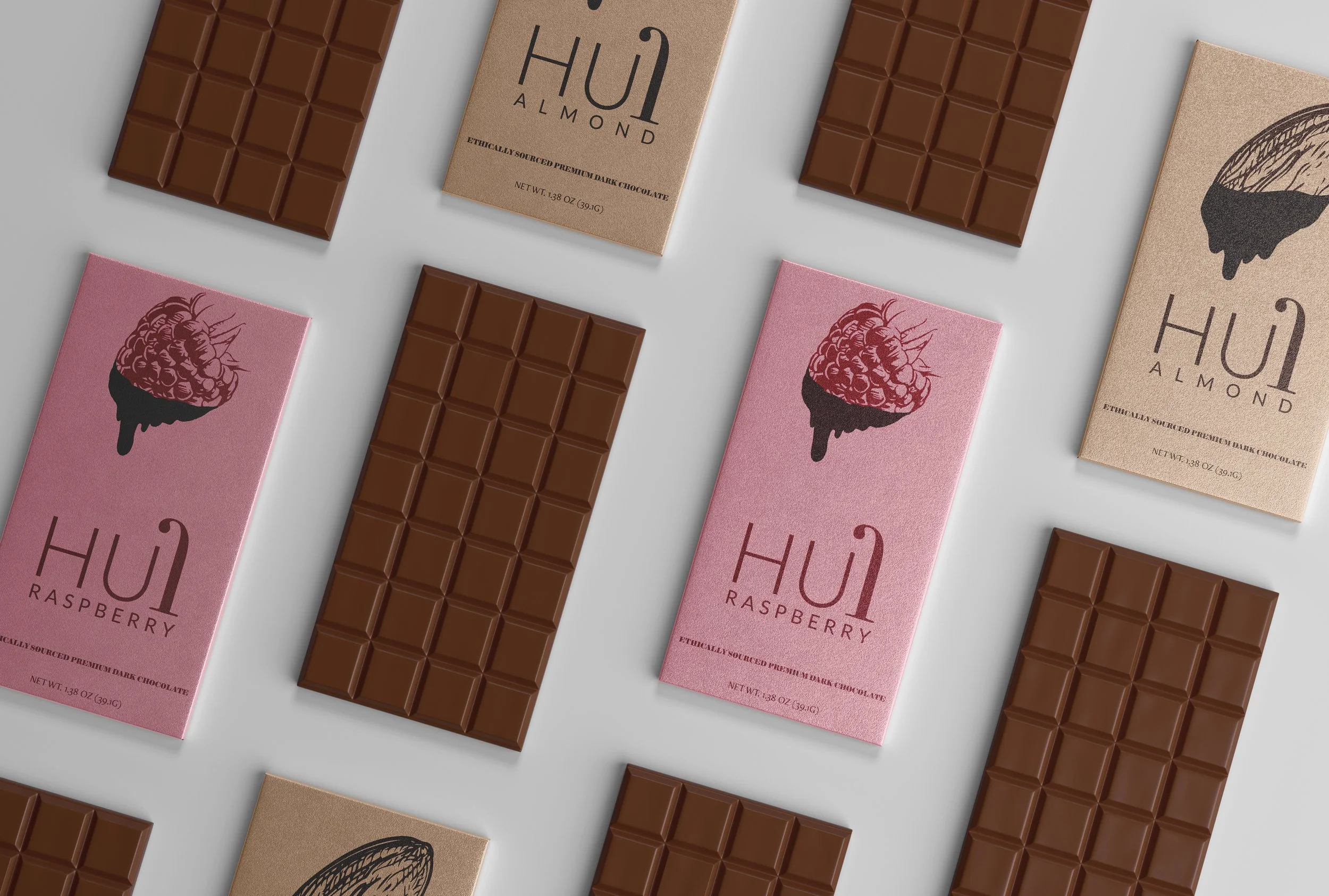
HUI CHOCOLATE
The packaging for Hui is a testament to the artistry of typography.
Drawing inspiration from typographic studies, the design features a harmonious blend of typefaces, balancing readability with visual impact. The overall composition is meticulously crafted, with careful attention to spacing, alignment, and hierarchy, resulting in a packaging design that is not only aesthetically pleasing but also functional and user-friendly.
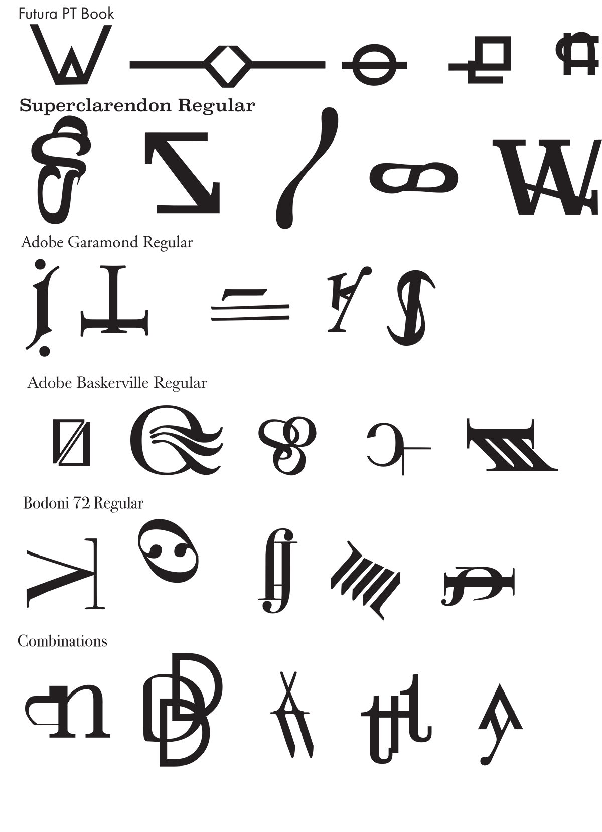
Type explorations began with connecting pieces of letters together to create interesting shapes. These shapes ultimately inspired the name, logo, and overall design for the candy bar.