logo design
holistic life studios
Holistic Life Studios exists to support individuals through life’s challenges with compassion and community.
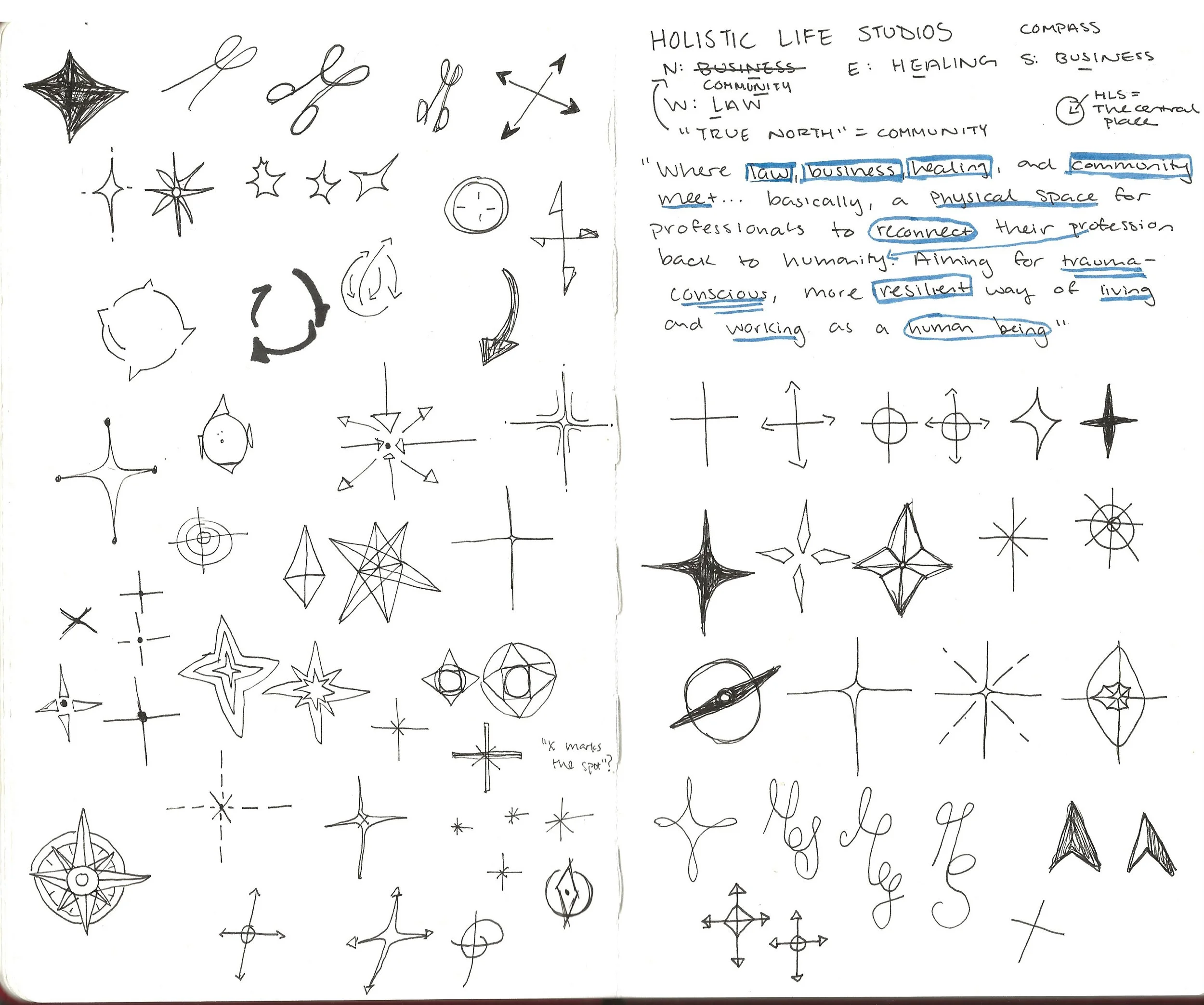
By bringing together professionals across legal, wellness, and creative disciplines, the studio offers a space where guidance, collaboration, and personal growth can thrive. Where law, business, healing, and community meet… basically a physical space for professionals to reconnect their profession back to humanity. Aiming for trauma-conscience, more resilient way of living and working as a human being.
BUILT WITH THE COMPASS IN MIND
Holistic Life Studios requested a compass as their main imagery for this logo. The compass represents the idea of placement – that this is the location, the physical space, you travel to. It brings that raw humanity to the stage, as each person is met at where they are on their journey.
NORTH: COMMUNITY
SOUTH: BUSINESS
EAST: HEALING
WEST: LAW
COMMON GROUND
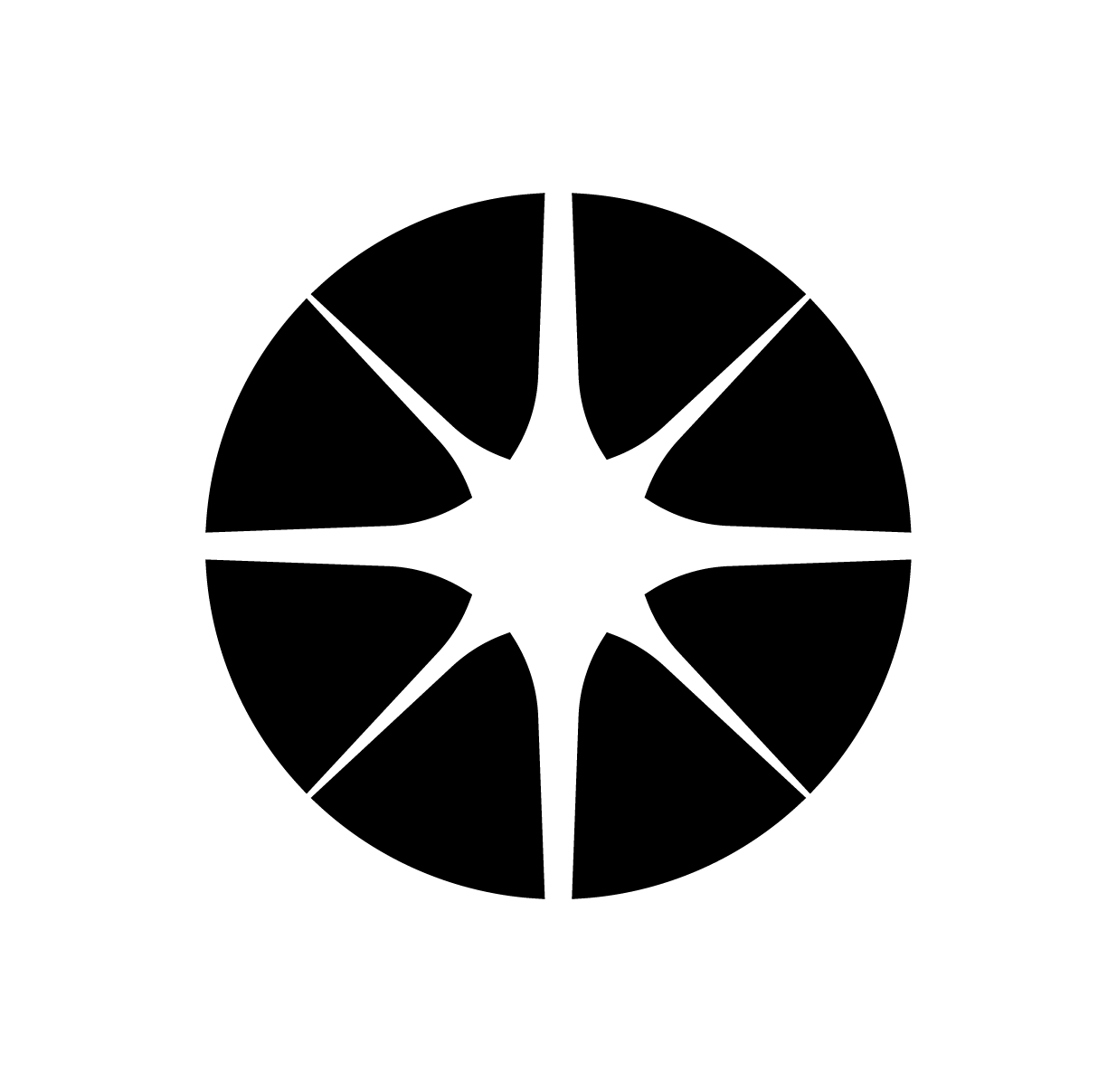
This concept uses negative space to form a subtle Compass rose, allowing the shape to emerge rather than be explicitly drawn. The surrounding black forms can be read as abstracted human figures, suggesting individuals coming together in a shared space. Their circular arrangement reinforces the idea of community, connection, and collective support. The soft, almost organic interaction between the shapes introduces a sense of humanity and approachability, aligning with the studio’s trauma-conscious values. Altogether, the mark becomes less about direction as navigation and more
about orientation through people and shared experience.
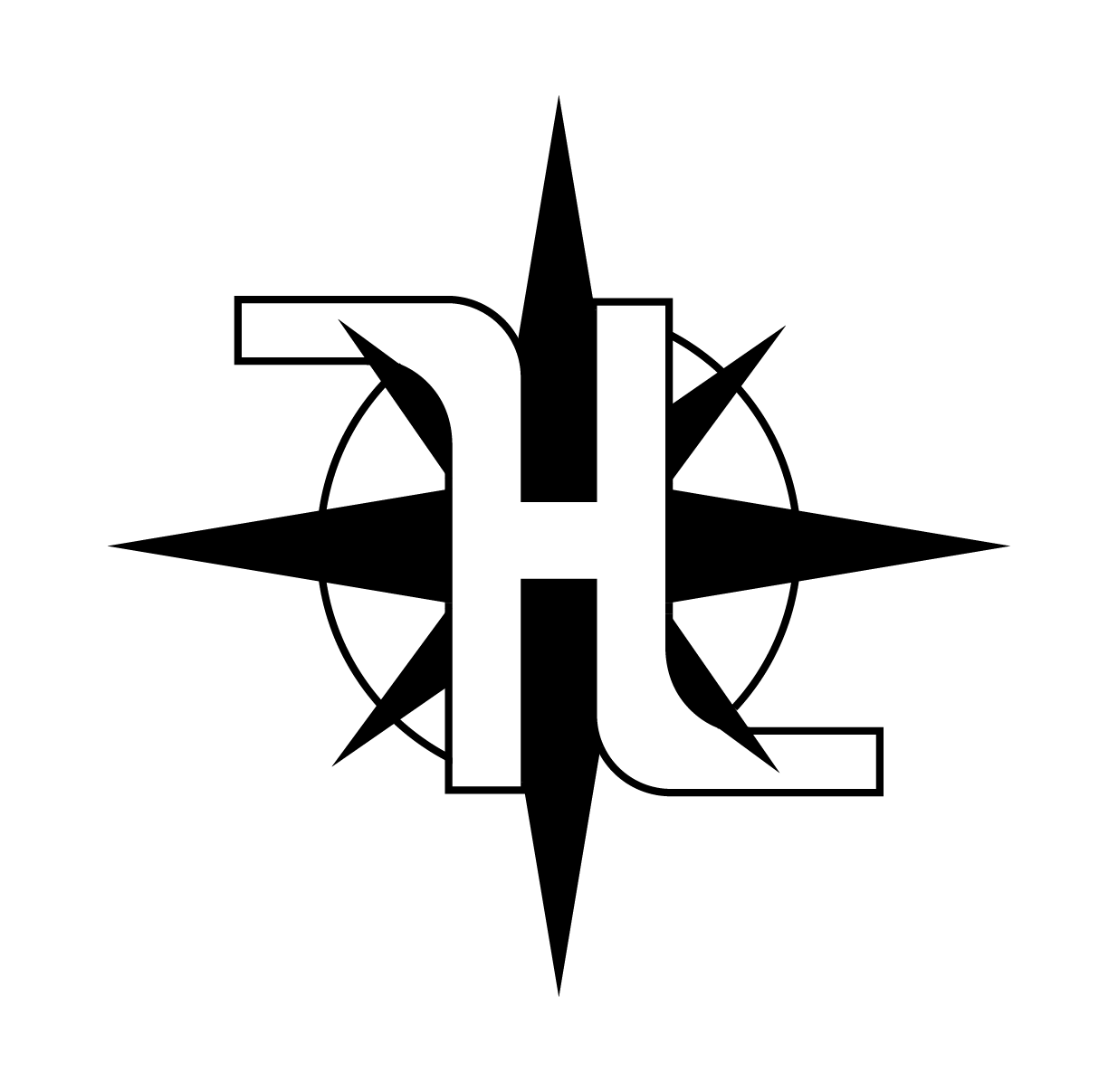
ALIGNED PLACE
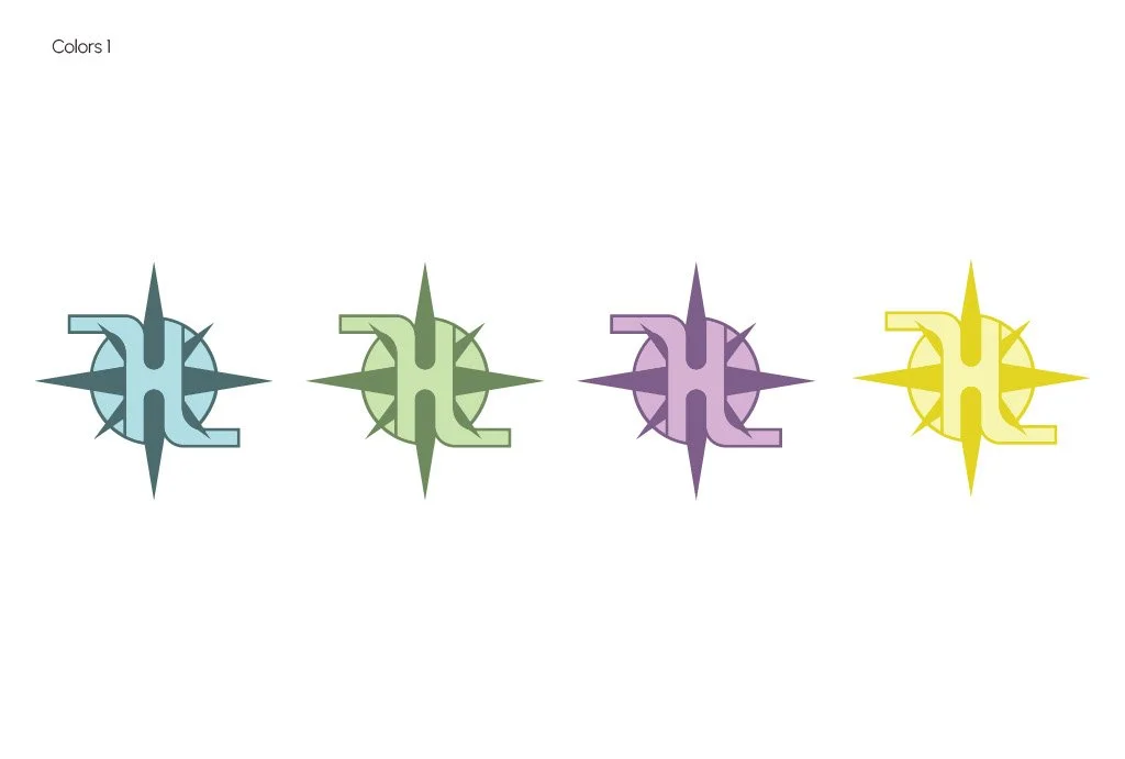
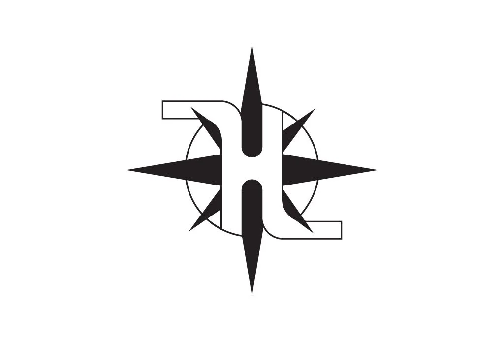
This direction integrates a clear “H” and “L,” with an implied “S” woven through the composition, grounding the identity directly in Holistic Life Studios. The Compass rose sits in relationship to the letter forms, almost embracing them, reinforcing the idea that this is the place where multiple disciplines come into alignment. Rather than existing as separate elements, the compass and typography work together to express unity—law, business, healing, and community converging within a single, intentional space. The structure feels both stable and directional, symbolizing guidance while remaining rooted. This concept most clearly communicates that HLS is not just a philosophy, but a physical and relational hub where these pillars meet and support one another.
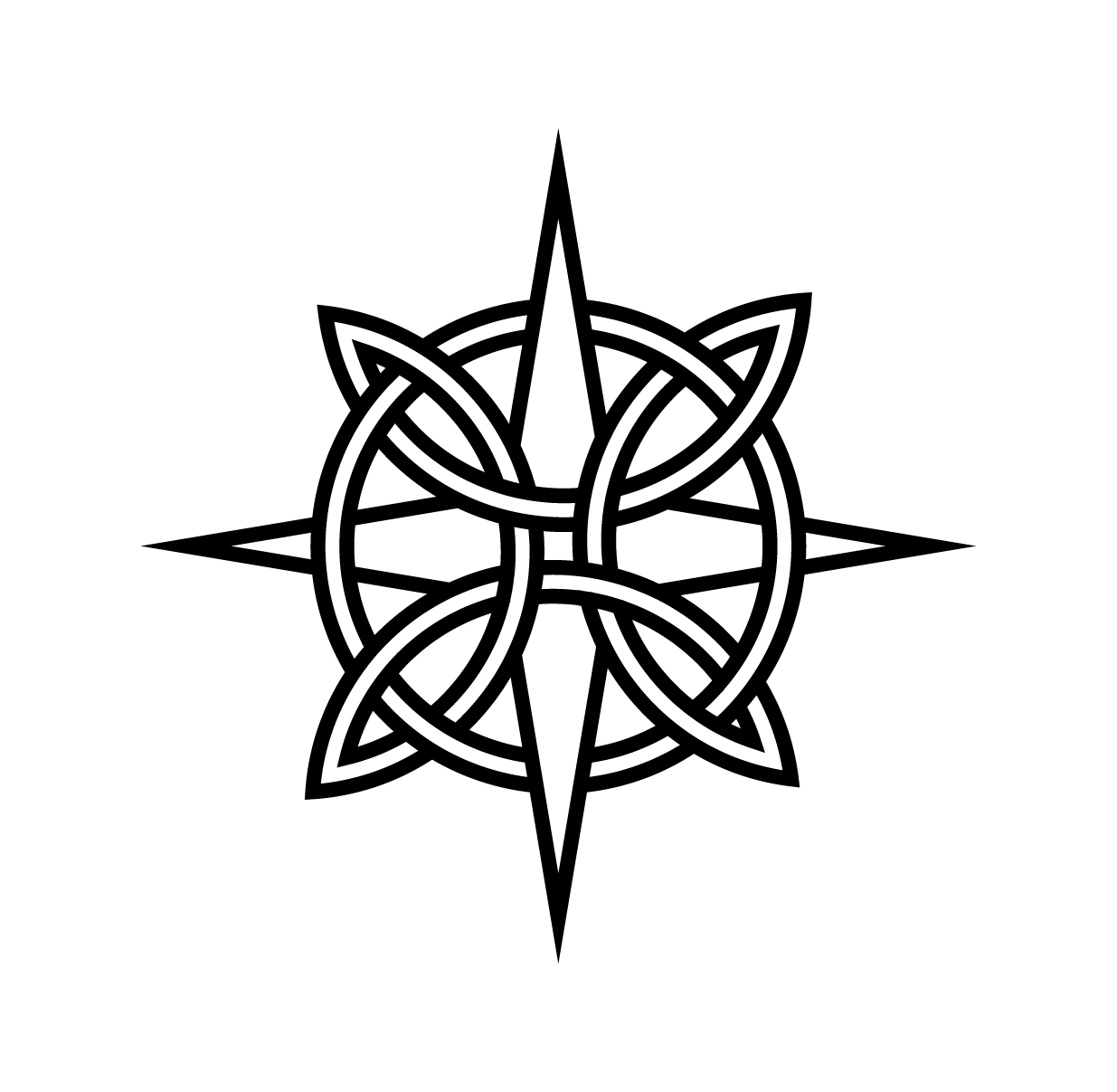
WOVEN UNITY
This concept draws inspiration from traditional Celtic knot forms, using interwoven lines to symbolize connection, continuity, and resilience. The knot structure reflects a return to humanity—where individuals, disciplines, and experiences are deeply intertwined, reinforcing a sense of community and shared existence. Rather than operating in isolation, each element supports and strengthens the whole, echoing HLS’s commitment to reconnection and collective well-being. This visual language also nods to something ancient and human, grounding the brand in a sense of timelessness and rooted wisdom. Within the center, an abstract “H” begins to emerge, subtly tying the symbol back to Holistic Life Studios.